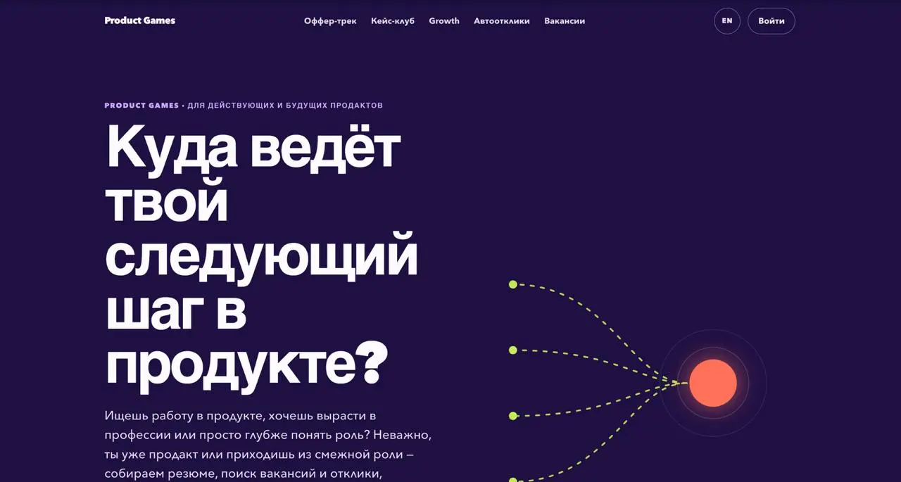
Готовые промпты, как сделать дизайн ленда менее ИИ-шным
ИИшные дизайны как дизайны с Тильдой - вроде норм, но многим приелись. Слету его там просто не поправить, поэтому классно, что нашелся человек, который структурировал подход к нестардатным дизайнам лендингов.
Сделал это Аншу Чимала (12 лет проектировал ИИ-продукты в Apple). Смысл его подхода в том, чтобы силой увести модель от среднего. Вот 5 приёмов, как это делать:
1. Генерация через случайный ключ (Seed string) Промпт сделай уникально выдаёт псевдослучайность. Приём от Sakana AI: заставьте модель сгенерировать случайную строку и строить концепт от неё.
Build me a landing page for my product. Follow this procedure: 1. Generate a long, random alphanumeric string using a shell script. 2. Define the creative direction (color scheme, layout, typography) based on the string. Look beyond the surface for subpatterns, special numbers, anything that inspires you. 3. Use your judgment to bring this direction to life and make it look great. Don't reveal the string in the design. It's only for your inspiration.
2. Задавайте конкретное видение, а не просьбу удивить Вместо абстрактной красоты задайте точные рамки вселенной.
Build me a landing page with a bold pixel art theme. Each section should feel like a still from a video game, yet it all functions as a landing page.
3. Идеи ищите в три шага: 1. I want a bold, unique design language for my product. List as many ideas as you can, with short high-level descriptions. Go broad, not deep. 2. Here's direction X. I like this, this feels tacky, add texture, avoid the cartoony look. Sharpen it to my taste. 3. Write a concise prompt an AI agent could use to build an initial POC page with this.
4. Отдельный агент-критик Модель не может оценить свой дизайн честно, потому что смотрит на собственный код. Нужен второй агент, который видит только скриншот. Дорогую модель ставьте критиком, дешёвую - исполнителем.
Improve this design. To decide what to focus on, use a subagent as a design critic. At each iteration: 1. capture a screenshot of the current design; 2. invoke the critic in a fresh context with just the screenshot, not the code or earlier iterations; 3. ask it to evaluate the aesthetic the design is going for, imagine how a top design studio would execute it, outline the biggest gaps, and give a score out of 10. Guidance for the critic: consider both overall composition and fine details; penalize patterns that feel overdone or obviously AI-generated; give tight, specific feedback. Your work is complete only when the critic independently deems it 9/10 or higher. Don't put that criterion in the critic's prompt; keep its scoring objective.
5. Настоящие изображения вместо градиентов Агенты любят обходиться декоративными фигурами и градиентами - это главный маркер нейросетевой работы.
The design is pretty plain. Add more personality using image generation. Consider shaders or 3D effects combined with images. For image generation use my API key: sk-... . Verify your work frame-by-frame in the browser.
6. Убирайте лишнее Главный признак ИИ-дизайна - переусложнение. Премиальность строится на сдержанности, но модель сама ничего не урежет без вашего указания.
Simplify the layout into an image-centric grid. Get rid of gradients, glows, and unnecessary containers. Aim for a truly minimalist aesthetic that feels native. Less on the screen often says more.
Поэкспериментировала - вроде и правда неплохо работает. Первое изображение - после, второе - до. Правда итерации с критиком жрут токены как не в себя. И это пока лендинг оценен на 6 из 10, теперь жду сбора лимитов 😄
Источник: https://www.lennysnewsletter.com/p/how-to-turn-your-ai-into-a-world
@productgames